UX Design of a self-assessment for older adults, with a 5-point Likert scale
While surveys and self-assessments are abundant on the web, actually there is little UX guidance to be found on how to optimize the design. Sure, there is tons of research on the scientific design of questionnaires, but not so much on the best user experience. It is surprising that this part of survey design is so shabbily treated, given that a good or bad UX may influence the actual scientific outcome. Aside from unintentional errors, a bad UX will results in users disliking filling out the questionnaire, and increase abandonment. In this article, I will go over the UX design of an online questionnaire, mostly filled out on tablet (mobile first), for older adults in care homes. I hope to inspire and get feedback from UX designers struggling with the same assignment.
Self-assessment Quality-of-Life older adults
First some more background information on the assignment. The purpose of the survey is to measure quality of care and relatedly, overall well-being of the older adult. Most of these questionnaires are filled out by a professional caregiver for the older adult. Our aim is to transform this questionnaire into a true self-assessment, one that the older adult can fill out him/her self. This has several advantages. First, no reliance on a professional caregiver. Secondly, it is the hope that older adults will fill out the questionnaire more frequently. And thirdly, self-assessment may limit some of the typical pitfalls in interviews, such as social desirability.
The questionnaire is lengthy with 50 questions over 10 different topics. Given that it is a copyrighted questionnaire (InterRAI QOL), we will not disclose the actual questions. But it can can be good to know that questionnaire polls for Privacy (2 questions), Food and Meals (5 questions), Safety and Security (3 questions), Comfort (5 questions), Daily Decisions (7 questions), Respect by Staff (4 questions), Staf Responsiveness (7 questions), Staff-Resident Bonding (6 questions), Activities (6 questions), Personal Relationships (5 questions) and finally Other (5 questions). Except for Other, all questions are to be answered via a five-point Likert scale, with answers ranging from 0 (Never), 1 (Rarely), 2 (Sometimes), 3 (Most of the time), to 4 (Always). The ‘Other’ category actually ask for relational status, gender, age, health and the duration of stay in the care home. Hence, ‘Other’ represents data that you would expect to be stored under the profile of a user.
As part of the user requirements, it was established early on that the preferred platform for filling out the questions is a tablet. Ideally, the user has his/her own tablet. However, it is also likely that tablets are distributed by the care home. Moreover, during earlier tests, it is also found that filling out many items on one screen is confusing. Hence, the default view is one question per screen.
The bare bones
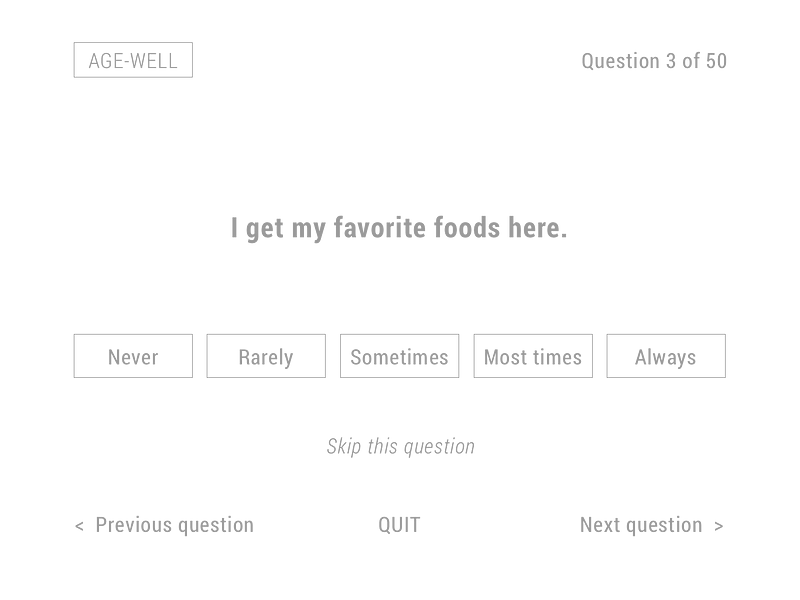
We start with an analysis of the UI components that make up the use. The primary components are the question, and the five answer possibilities. Besides the question and answer options, we also need to be able to to navigate back and forward through the questionnaire. And given that this is actually very much the design pattern of a wizard, it is also nice to inform the older adult of at what question he or she is, in the process. And finally, you also want a label that tells the older adult the name of the questionnaire. Finally, it can also be nice to have the option to skip a question. I have laid out the elements below. Now, there may be more elements necessary. But these seem to be the basic elements.

While I am not yet focusing on the actual type or color, I do already try to focus on the the actual size and the hierarch of the elements. I realize that the answer options maybe too small. I also play around still with some elements. Especially “Skip this question”. I doubt whether I should place it closer to the actual question, after all it applies to the question, or whether I should place it at the bottom with the navigation. In the end, I decide for a location beneath the answer options.
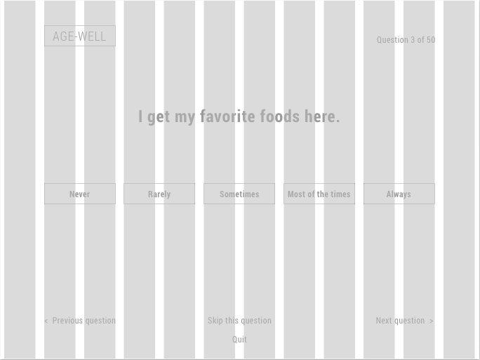
The layout is already keeping in mind the grid structure and the hierarchy. The illustration below shows the actual grid structure.
Adding color
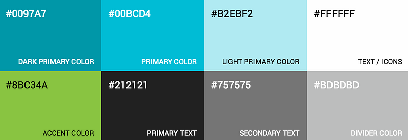
Okay, now it is time to add some color to bring life to the screen. If you are a fan of material design and its color schemes, a nice way to define your color palette is by going to Material Palette. Choose a primary color (for example cyan) and an accent color (light green), and your color scheme is created for you.
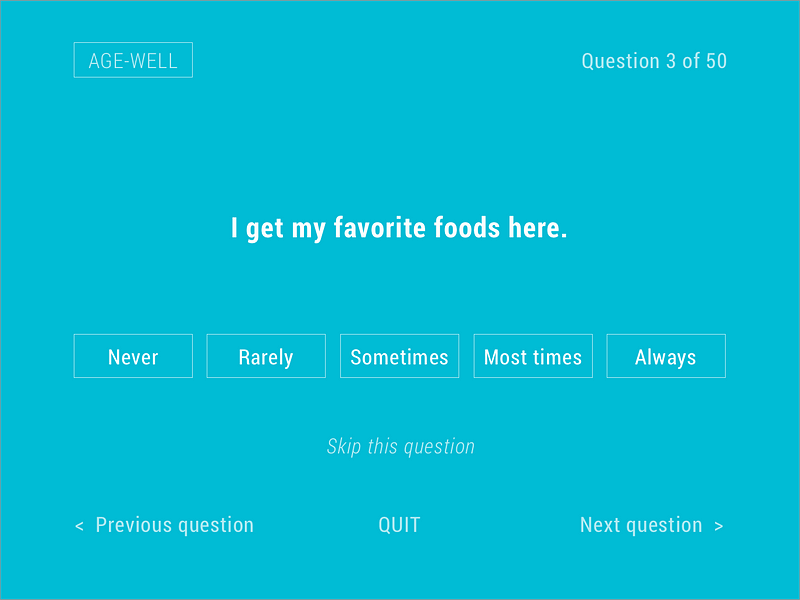
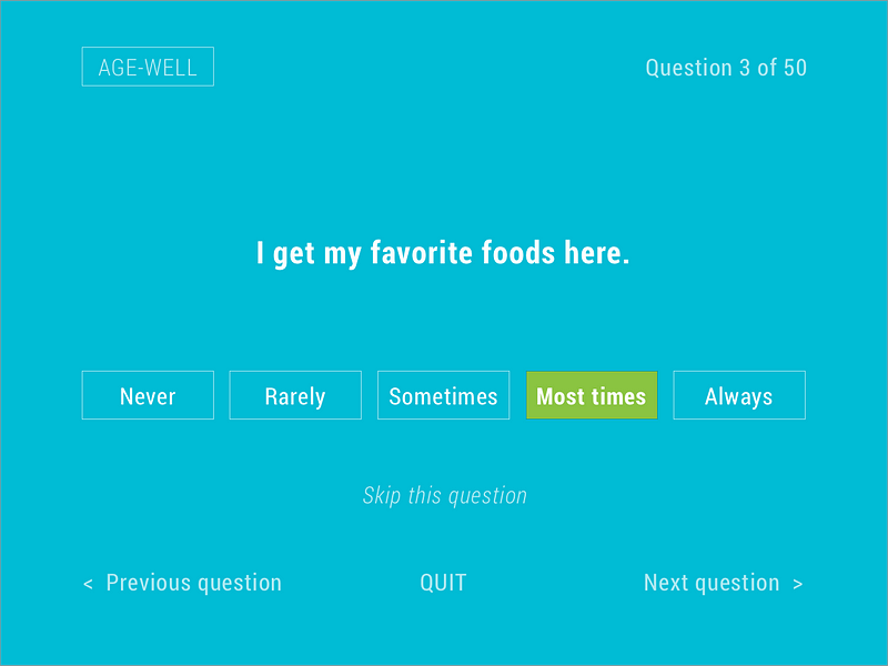
All cyan
The question and the answer options are styled in white, to create a stronger constrast with the cyan background. The accent color is chose to mark the answer that is selected. The other options are light blue.
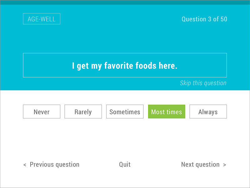
More white please
Honestly, the current UX design is quite too cyan for my taste. Let’s see if we can bring some elegance to the design.
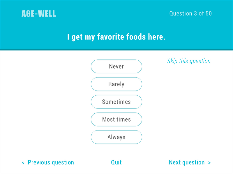
Less boxes
While this layout is not as heavy as the first one, it still feels boxy. While the current design is clearly material design inspired, I want to explore the effect of using rounded answer options, that have a clearer affordance of a button.

Rounded could work as well, but the different left and right padding in the answer options I find distracting. With the “Sometimes” and “Most times” answer option there is not enough left and right padding for this to work. I do not want to simply extend the answer rectangles, as this will disrupt my grid layout. What if I would position them vertically rather than horizontally?
Just to show different options.

Black print on a white background is generally to be preferred when legibility matters.